
The Right Ways To Ask Users For Permissions

Story Duration: 5 min


Use your keyboard arrows
to view the story!

...during one of the last weekends of the summer, I had a horror vision...
As I was enjoying this tasty local beer...


Winter will soon knock on our door steps!

Best time to try out Hopper...
A promising travel booking startup based in Montreal!

I just want to have a quick look at some airplane ticket prices.
My psych is fairly low—I want to go back to enjoying the lake as soon as possible!
Apparently, Hopper knows a thing or two about psyching people up for their next trip...
Psych Level: 30%
Ohhh... This screen {POPS} ;)
No but seriously, this is some serious visual priming, with the airport landscape.
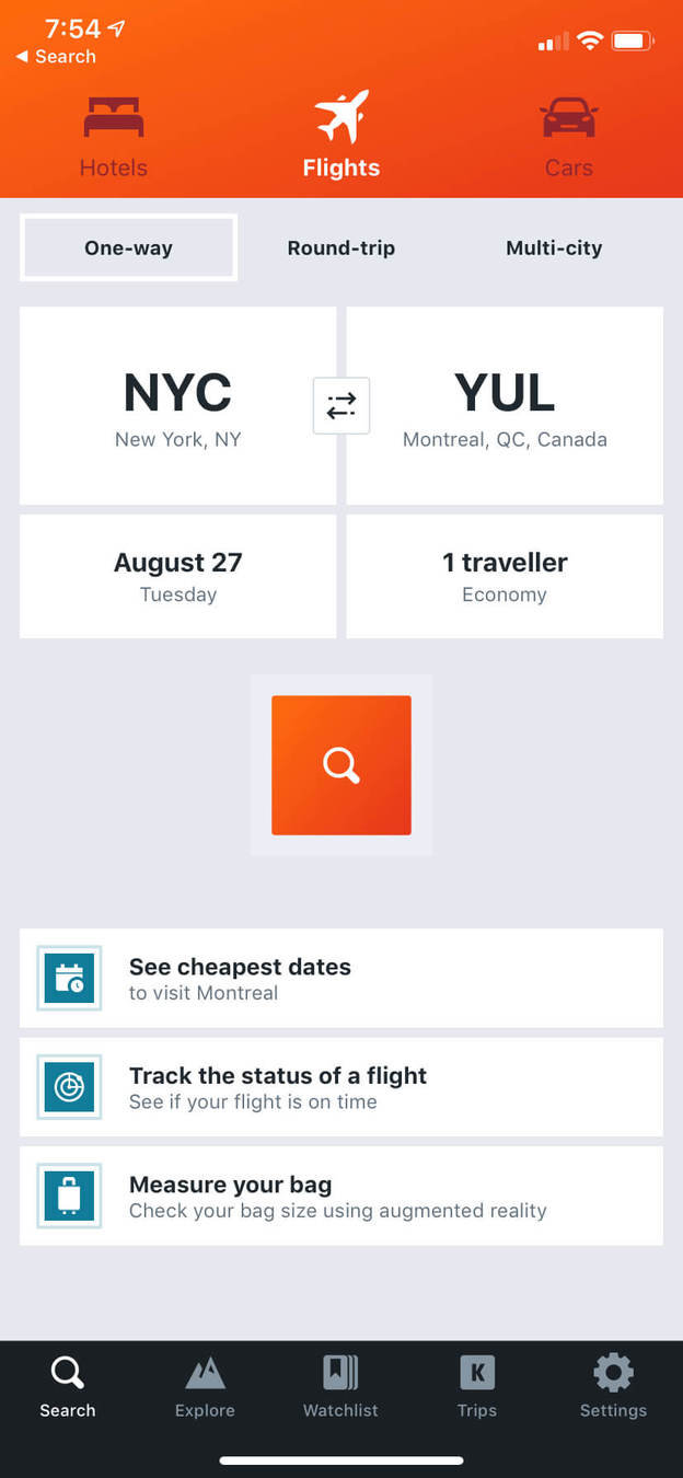
Priming
Priming consists of subtle visuals that influence how we respond.
The friendly-looking airport landscape lets the users dream about their next trip increasing the chances of a positive experience. 1 Wikipedia, Priming Psychology (2019)
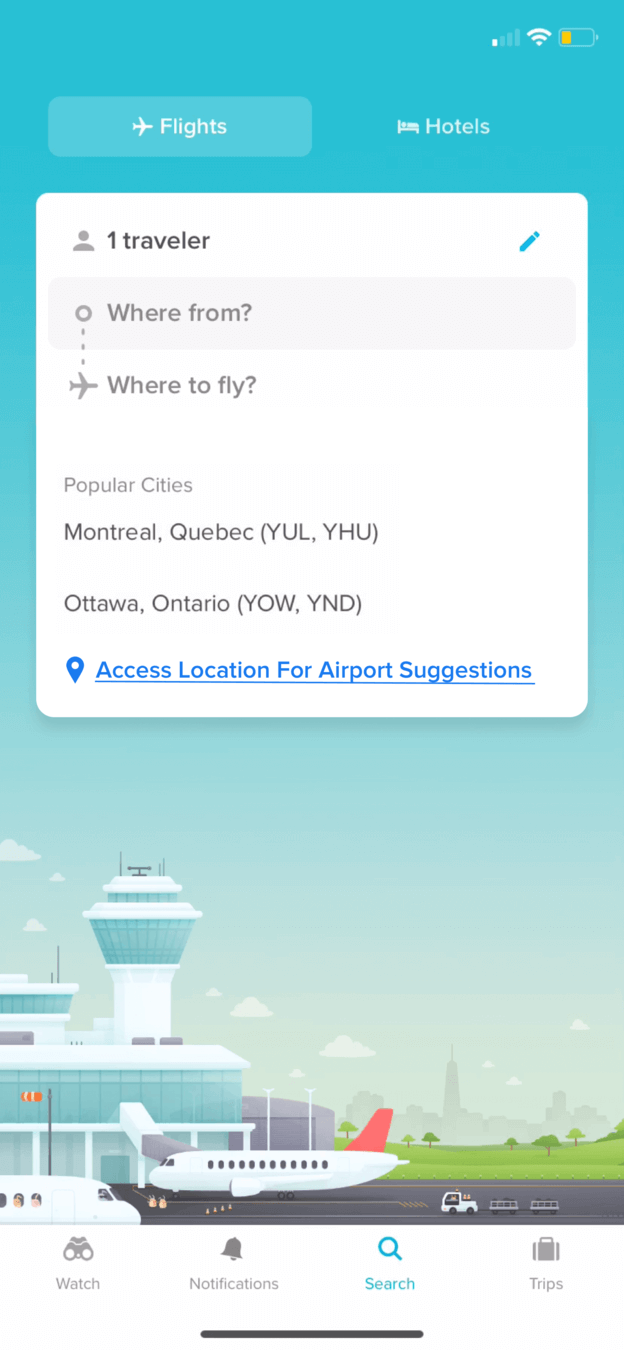
Progressive Disclosure
Encouraging users to move from completing simple actions to executing more complex ones lowers the chances that users will feel overwhelmed. 1
In this case, Hopper offers simple actions to start with: Where from? And where to?
1 Prototypr.io, Designing for Progressive Disclosure (2019)Plus, it's one of the simplest travel booking home screens I've seen...
Compared to Kayak which has 2 extra fields to think about: Trip type & Dates.
And for which the default choices are somehow more confusing than not.
They also have multiple CTAs clutter the home with important visual weight.


Let's do this... {TAP}
Surprisingly, everything got serious real quick...


Hmm... Where did the dreamy airport go?!
I couldn't finish that thought...

Oh... That was quick. Nope.

Little did I know, Hopper is already a master of this technique. Stay tuned...
User-Driven prompt
If you need information or private access early in the product experience, implement ways where the user deliberately triggers the prompt.
When actions are driven by user intent, the experience on the user's side feels more natural; hence, the better conversion.
Here's one way to solve this:
(Just press ▼ on your keyboard)
Hmm... in reality this was very contextual.
Asking for location access when entering the "where from"...
...But it was too early in the experience to have my trust.
Which brings me to—
Displaying direct benefit of the feature
Letting users decide if they want Location Access
Keeping the background in context minimizes navigation and keeps the user dreaming*
User-Driven Notification Prompt
Objective:
- Increase Location Access Conversion by 4%
Growth Experiment
powered by Growth.Design

Philippines seems like such a vibrant place right now, with plenty of co-working spaces!
Let's see... {TAP}
Filling in the destination field...

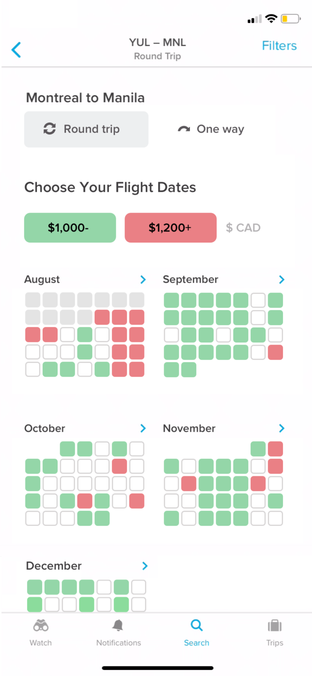
{} ... A lot of alarming colors! Everything was so light and calm...
Nonetheless, notice how they're guiding me through incremental decisions.
Instead of putting everything on the home screen. Easier to follow!
Filters? It seems odd to have filters take a lot of primary space.
Also, it took me a while to realize there was only 50$ difference between color tags.
Do we need such granularity?
Overall... There's still a great opportunity to reduce cognitive load—
Minimize cognitive Load
Extraneous cognitive load refers to the way information or tasks are presented to a user.1 The more information the heavier the load.
Here's a suggestion to minimize this!
(Just press ▼ on your keyboard)
1N/N Group, Minimize Cognitive Load to Maximize Usability (2013)
Minimize Cognitive Load
Objective:
- Lift "Flight Dates" completion by 3%
Growth Experiment
powered by Growth.Design
Less granularity to quickly understand price differences. What's cheap and what's expensive.
Lighter active color. Reducing attention of a quick choice.
Not putting any emphasis on "in-between" prices.
Reduced saturation to give a "calm" feeling.

Ooph.. Same satured colors.
Selecting the month of November... When days start to get depressingly shorter :(
However, the green stands out so it makes it easy to guide my choice...
Let's try to stay away from winter as long as possible! {GO!}

Finishing up...
Hmm...
I got stuck there for a second...
A nice white background behind the CTA would be perfect!


Ahhh, I should wait before buying.
Wow. Finally, an app that puts user interests before revenues.
Love it.
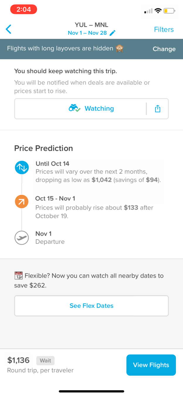
However, it took me a while to decode this from the page...
...And one of Hopper's most interesting features, price prediction, is hidden!
Wait... something red just popped...
Haha, he doesn't look happy!...
Not sure why though, let's see...
Information Overload
Information overload occurs when the amount of input to a system exceeds its processing capacity, often resulting in a reduction in decision quality.1
1UX Planet, 5 Ways to Stop Cognitive Overload From Killing Your UX (2017)

Perfect timing!
They just suggested I should wait for a better price—
—So why not give them the trouble of notifying me when I should buy!
{TAP}
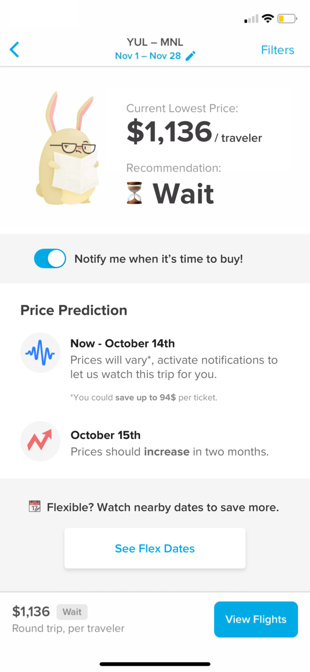
That's when Hopper took me by surprise!


Good job Hopper.
I didn't even see it coming. We're so used to see those prompts really early in the experience. {ALLOW}

Recommend ONE Action
Having a clear call to action and a clean interface goes a long way when a user is trying to decide what's the best course of action.
Here's one solution to solve this:
(Press ▼ on your keyboard)
Nonetheless... This screen needs to be optimized to ease decision-making.
Plus, critical information is completely hidden like "Flex Dates".
Simplified Decision-Making
Objective:
- Lift completion of flights review by 8%
Growth Experiment
powered by Growth.Design
Easy on and off notifications, taking less real estate
Clear recommendation reducing overall amount of text.
All the relevant information above the fold
Repositioned price prediction + better icons to quickly understand future price behaviors
Light background color to minimize border and line effects.

Wow unexpected overlay! Philippines, here we come!
That's the same reason why travel agency use fake palm trees and beach posters—
Temptation Bundling
We’re more likely to do the hard stuff when tightly coupled with something tempting.1
In this case, all this imagery serves as temptation, and it's very safe to say that booking a vacations is hard!
Good work Hopper!
1James Clear, Boost Your Willpower (2018)
Clicking the "See Flex Dates" button...
—to make you dream about your trip and let you forget about the hustle of planning.
Psych Level
Customer Journey
Hopper makes you dream right from the start with some undeniable visual priming!
The first location prompt was a bit too early, so I decided to tweak it to increase potential conversions.
Got a bit overwhelmed by all the colors when selecting date. Don't let cognitive load kill your design!
One of the smoothest notification prompts I've seen. Right when I needed Hopper to alert me when to buy my tickets.
The big Aha-moment, when Hopper recommends to wait before buying your tickets to save money.
The flexible dates overlay was such a nice surprise, and a strong "temptation bundling" that I had to slide it in there!
Before you go...
So here are the key moments in Hopper's onboarding experience...
Notification Experience
Score
A
Congrats!
You completed Growth.Design's Case Study #011:
"Hopper's In-App Notification Onboarding"
