
Use your keyboard arrows
to view the story!
Growth.Design Case Study #010
9 Ways To Boost SaaS
Revenues With A
Better Upgrade UX


Story Duration: 5 min
It happened a few days ago…
I was just sipping on a latte in a coffee shop in Montreal…

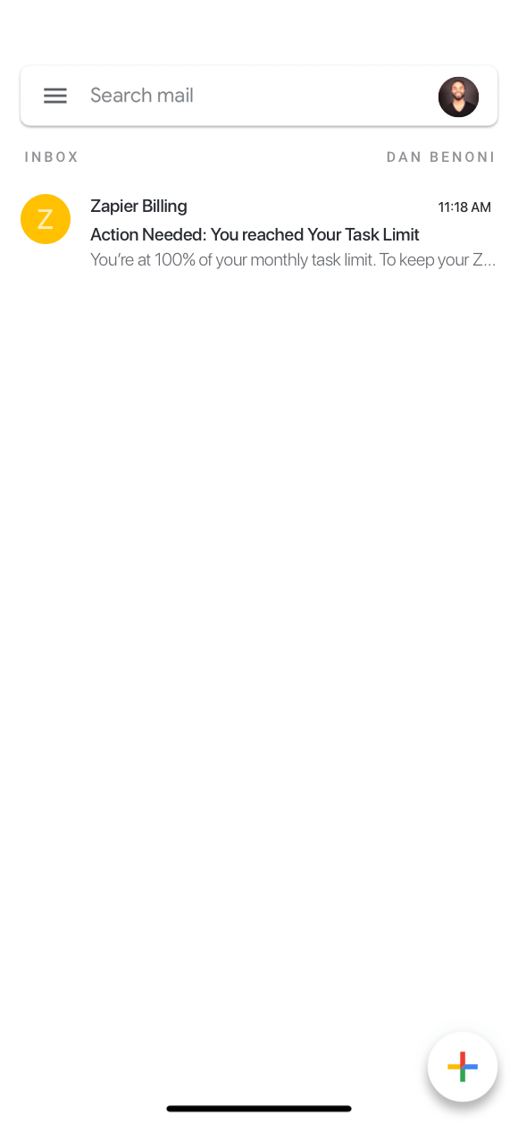
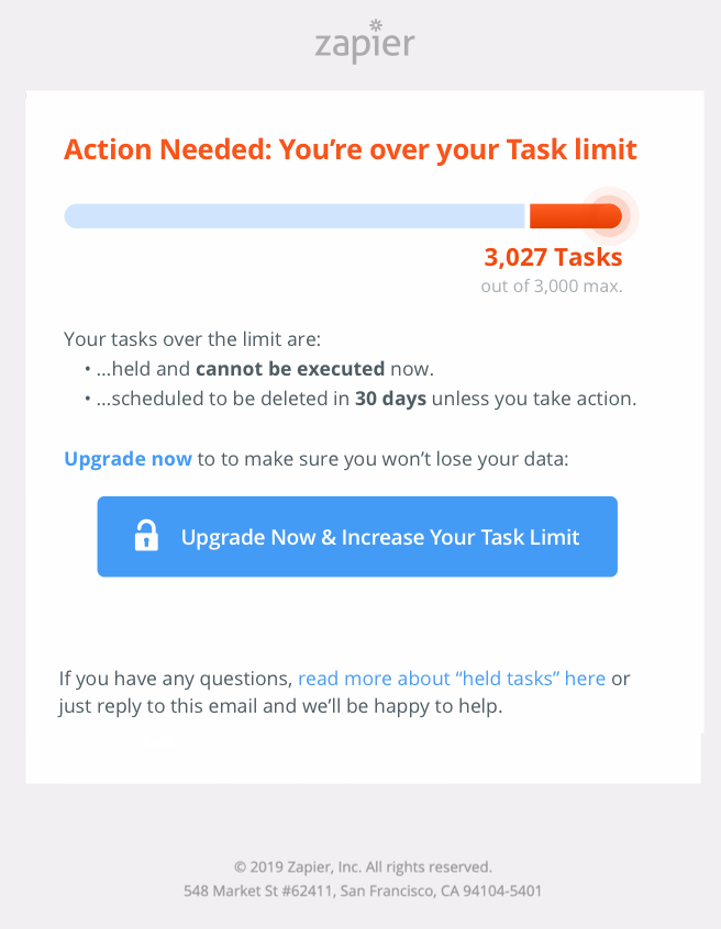
…that's when I received this unexpected email from Zapier…


We're happy Zapier customers because it saves us a lot of time, but…

… we have some critical automations. Missing even a single Task would be very bad for us!
Usage-Based Pricing
Zapier's "Tasks" are a great example of a value metric1. It's a metric that…
- is aligned with customers' needs
- is growing proportionally to usage
- is easy to understand
Find out what's important to your customers and build your pricing around that value metric to maximize upgrades.
Fun fact: Improving your monetization growth lever is 4x more efficient than improving your acquisition strategy. 2
1 SaaS Pricing and Value Metrics, Chargebee (2019)2 The Only Pricing Model You Should Be Using, PriceIntelligently (2019)


So I quickly grabbed my laptop out of my bag and…
…opened the email.

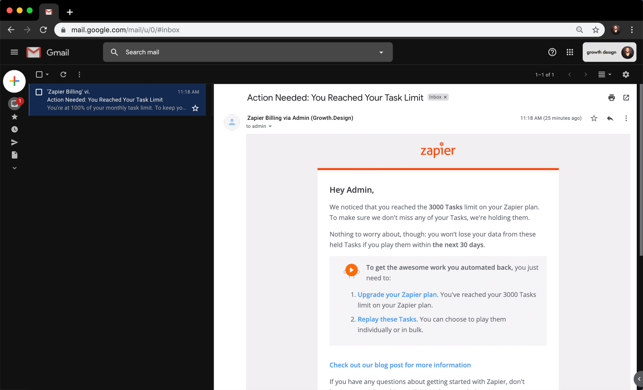
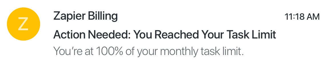
This subject line psyches me up right from the start!
"Action Needed" makes the urgency obvious.

As for the body of the email…


That introduction is a fair "white-hat" ransom.
It motivates me to take action now, but—
—why not illustrate it?
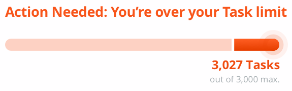
An overfilled bar would be a clearer way to alert me of this potential loss:
Loss Aversion
We hate losing or letting go of what we have (even if more could be had).
Using a visual anchor to reinforce loss aversion (e.g. illustration, progress bar) is a great way to maximize the engagement rate of your users.1
1Prospect Theory & Loss Aversion, NNGroup

The biggest problem is that this email does not look urgent.
Four elements are responsible for this…
1) 💬 Wordiness of content
2) 👀 Divergent call-to-actions
3) 💼 Link to apply for a job (!?)
4) 🐦 Social media icons
They simply don't fit with the urgency of the situation.
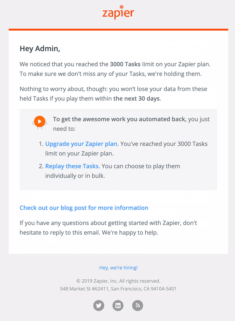
…this email would be a lot clearer with something like—


3. An obvious main call-to-action makes the next step clear.
—this!
1. Clear urgency and visual reminder of the potential loss.
2. Two short bullets summarize the key information.
Be Clear, Not Exhaustive
Emails that are critical to your customers should convey urgency and have one clear call-to-action.
This is better for your customers and it can lift your email conversion rate by 27%1 (or even up to 232%2).
1Email A/B Test Guide, CampaignMonitor (2019)2A/B Case Study, VWO (2019)
Alright—now let's upgrade our account and unlock our Tasks!
{click}
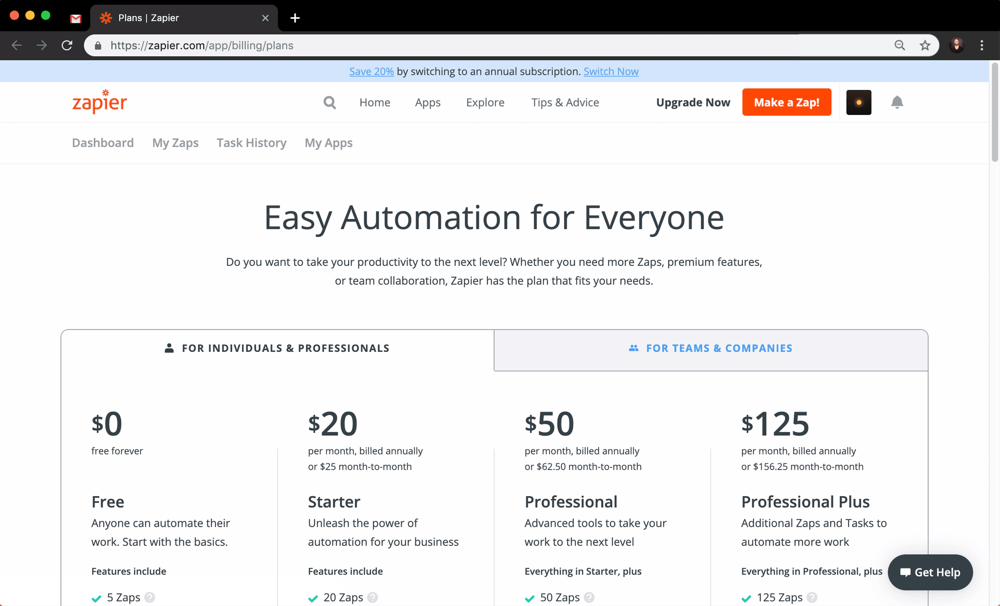

Hmm… nothing in this interface reinforces the urgency of our dozens of unexecuted tasks…
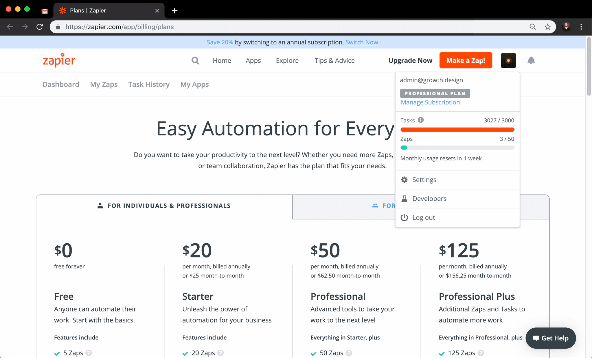
The only way to quickly see our task limit is by clicking on our avatar. {click}

Anyways, let's find the upgrade button…
{scrolling down}
Which plan is the right one for us?
Nothing here refers to our Task limit and those buttons are hard to differentiate
I'll have to keep scrolling… {scroll}
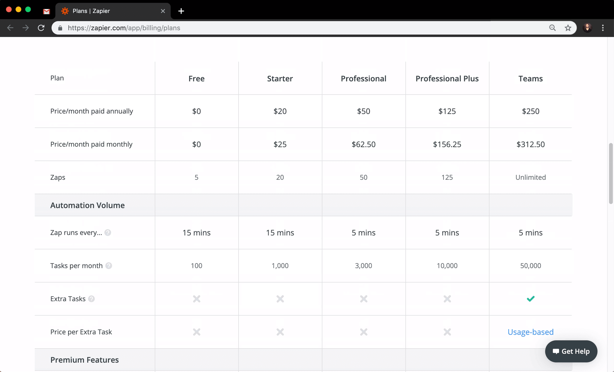
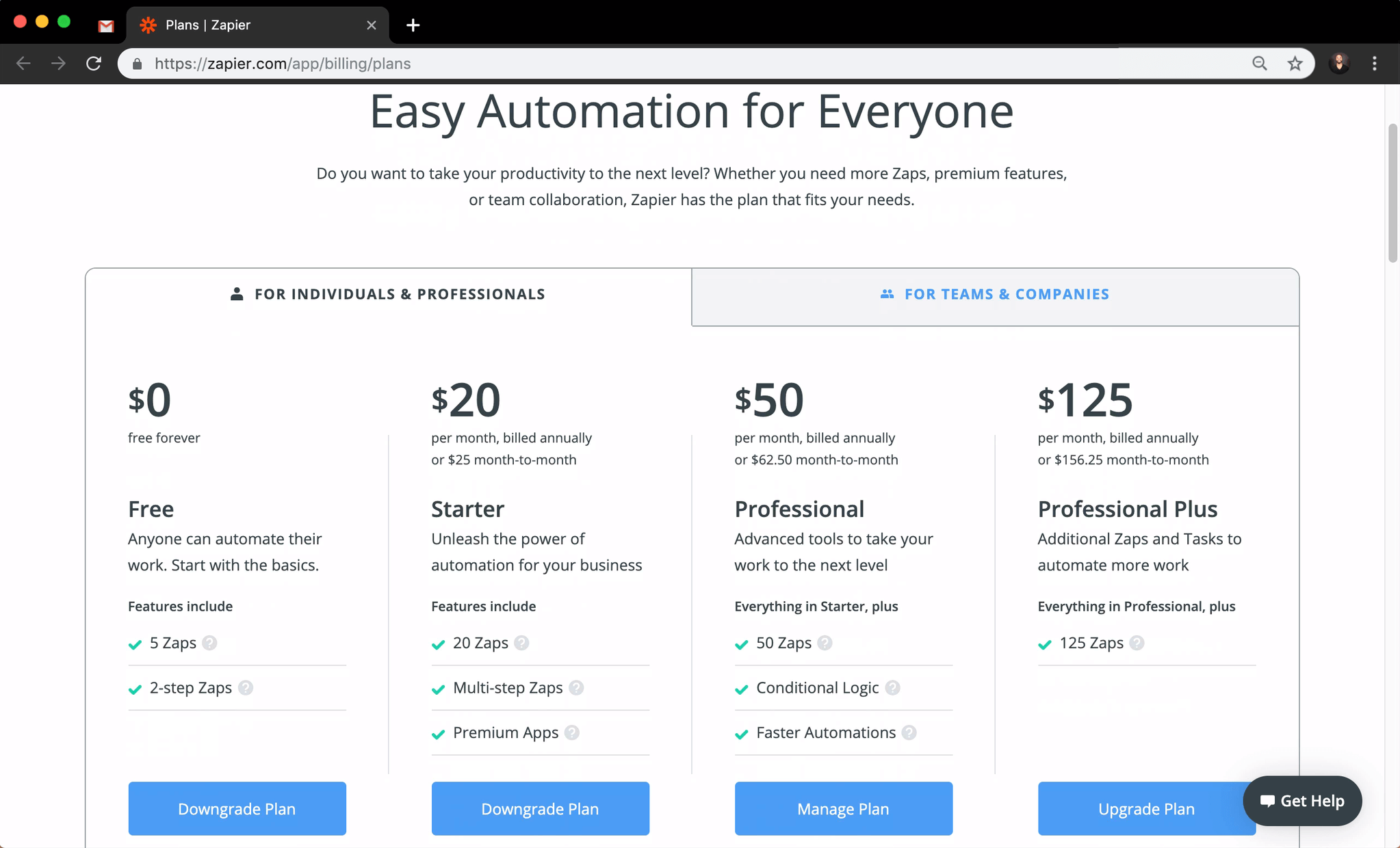
Woah. That table of features is exhaustive.
I'd happily upgrade just because of our Task limit.
Do I really need to read all this stuff…? {scroll}
A better approach would've been something like—
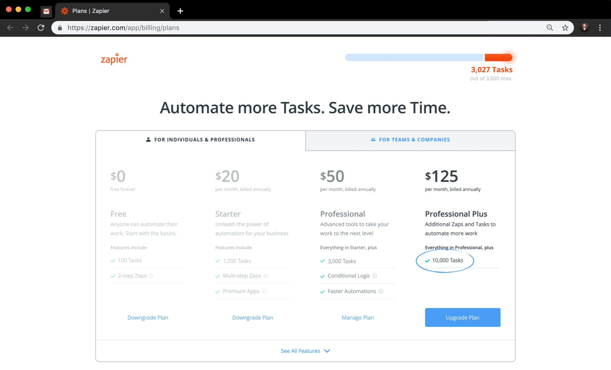
—this! Can you spot the 3 main differences?
1. Minimalist header with a clear reminder of the usage limit.
2. Highlight of the most relevant metric and plan for the customer.
3. Better visual hierarchy to make the main call-to-action obvious (and avoid endless scrolling).
Checkout Optimization
Your checkout experience should be optimized differently between:
-
💳 First Upgrade
from "Free/Trial" to "Premium" -
💸 Following Upgrades
from "Premium" to "more Premium"
Focus the journey of your customers around their most pressing pain point (my Task limit in this case).
1Upsell Strategies, Hubspot (2018)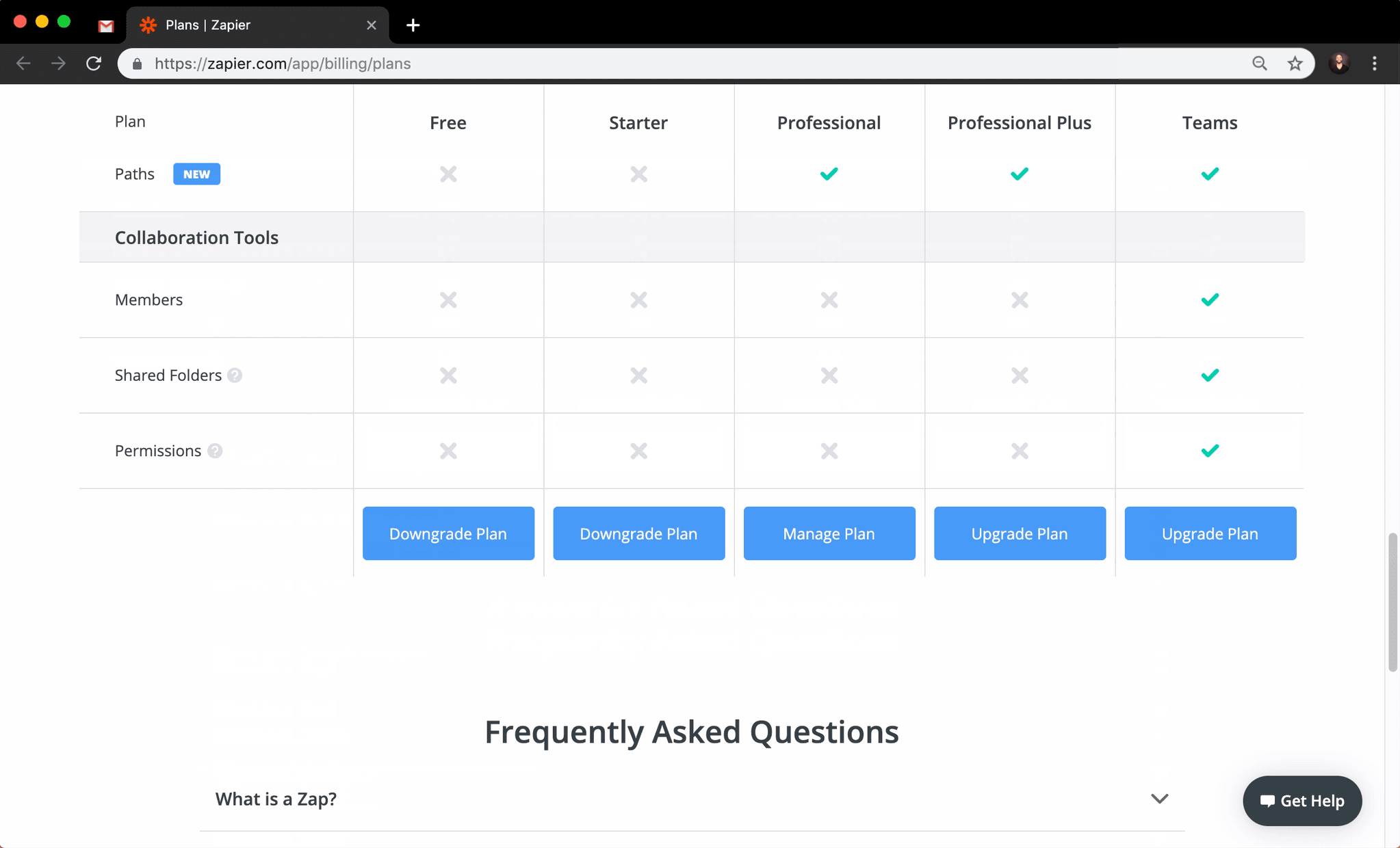
Ok. Let's upgrade to the 10,000 tasks plan.
I think it was this
4th column…
{click}
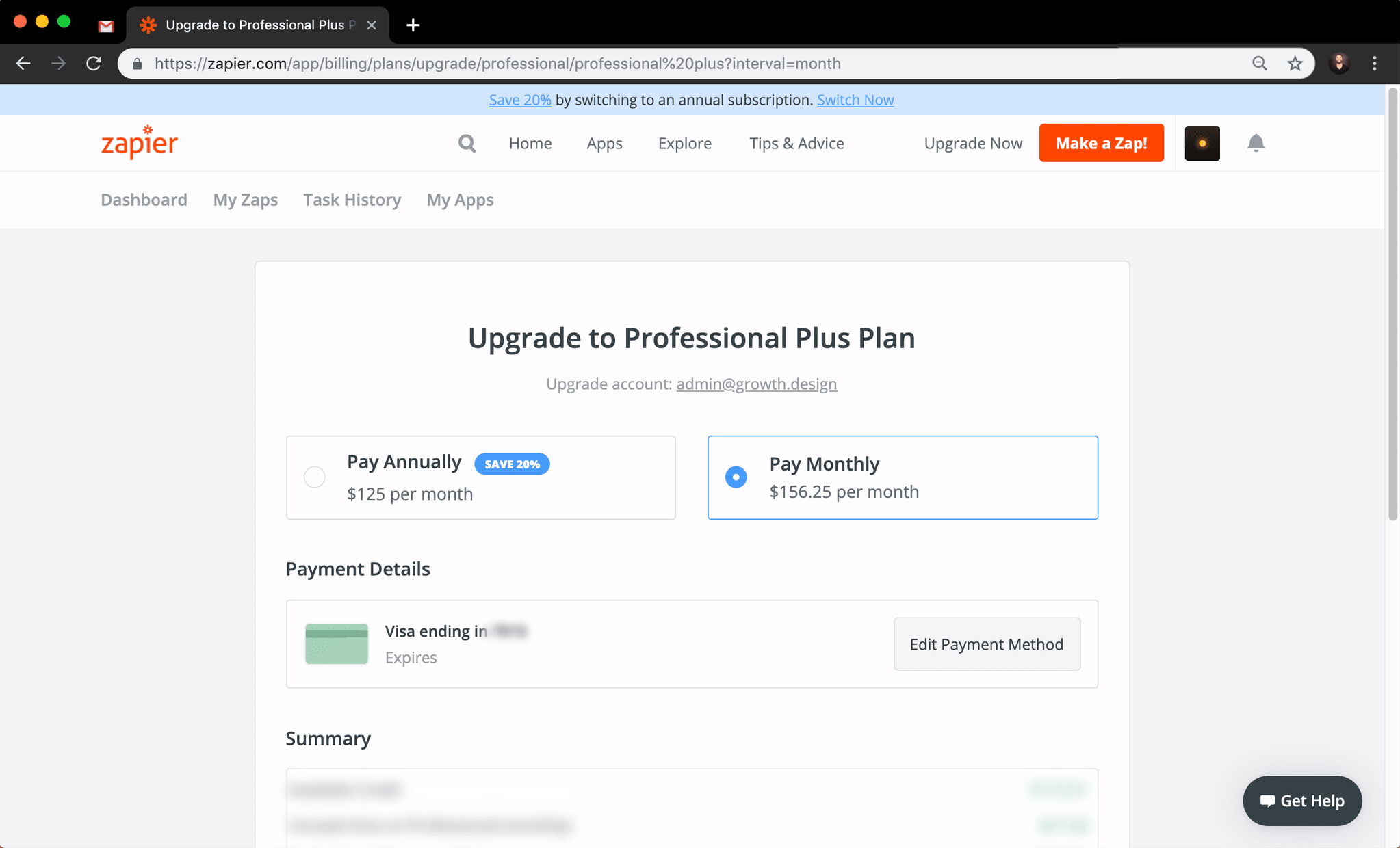
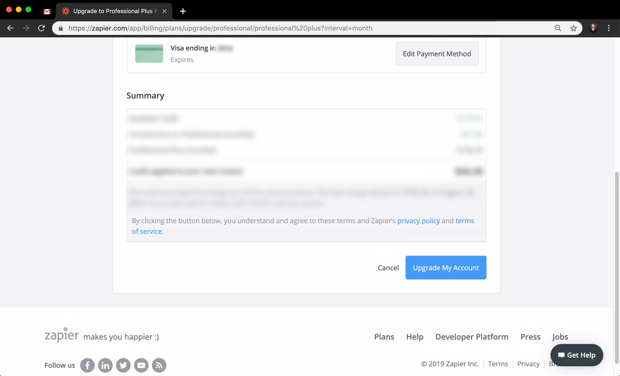
Hmm… the 15 header links are distracting me from this crucial checkout step.
{scroll}
Less Links, Less Leaks.
Our Trello case study showed that while navigation links are useful, they can also be an excuse for your visitors to leave.
Removing your header & footer navigations in your most critical pages (e.g. signup, checkout) may lift your conversion rate by 28%. 1
1 Hubspot, Statistically Significant Split Test (2014)
Ahhh…! There it is!
Clicking this button should finally execute our pending Tasks…

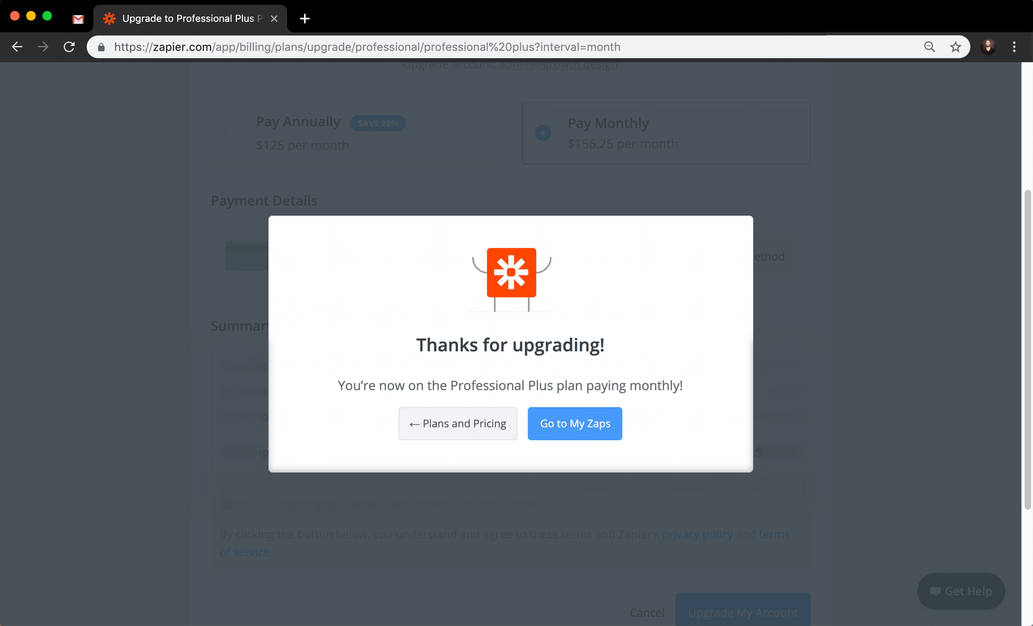
Oh, the confettis are a nice touch!
(…and they also take my focus away from the 156$ bill!)

Now I just have to make sure our Tasks are executed.
{click}
Peak-End Rule
We judge our past experiences almost entirely by their peaks—pleasant and unpleasant—and how they ended.1
We explain this in detail in Module 3 of our Product Psychology course.
Zapier could leverage that even more by celebrating the fact that their new customers will be saving time (not just "upgrading" as their copy says).
Something along the lines of:
"Cheers to even more time saved thanks to your new Tasks!"
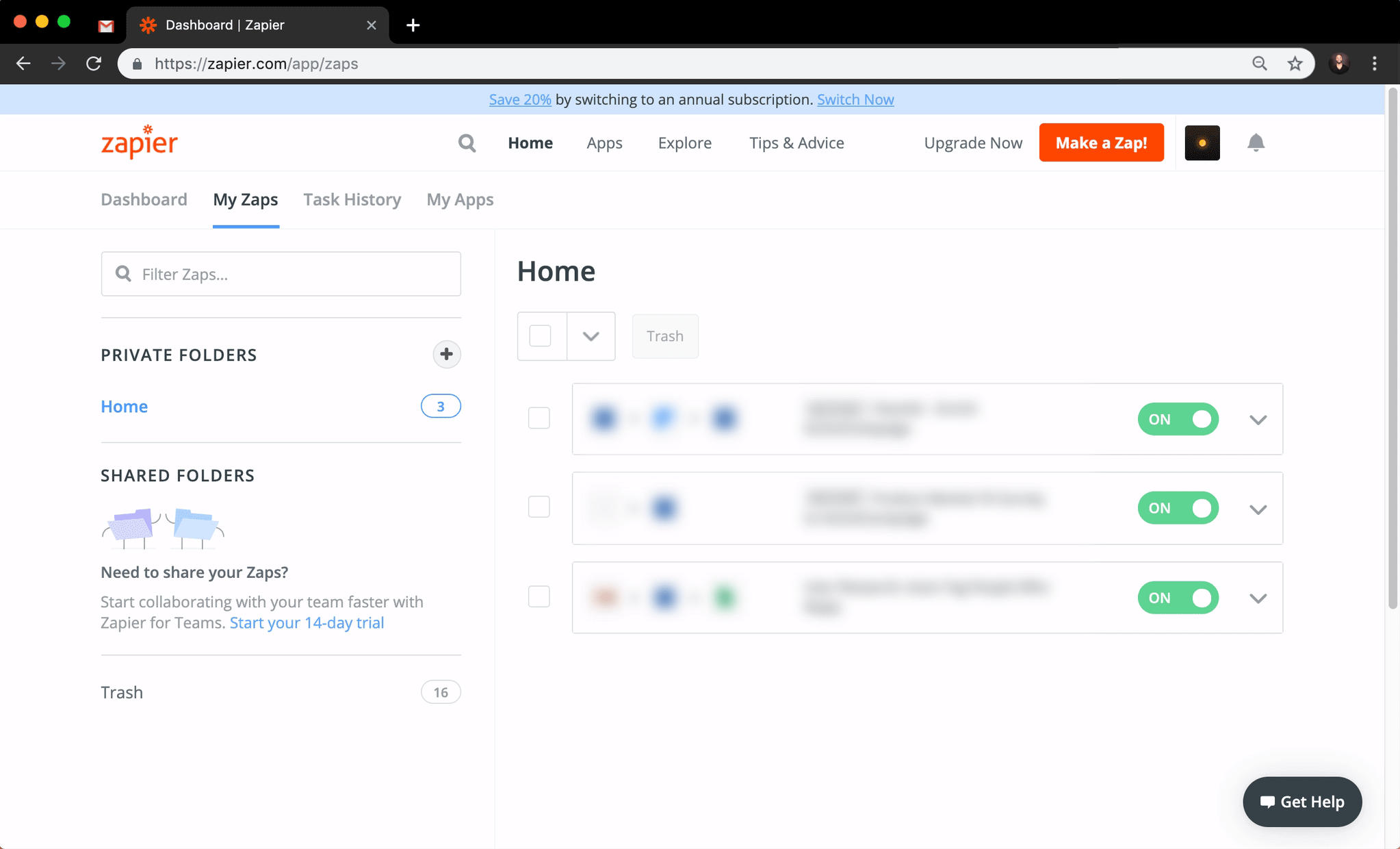
That's when I realized that the held Tasks were not executed by default…
Uh?… so it didn't work?
Something like this would've been more reassuring!
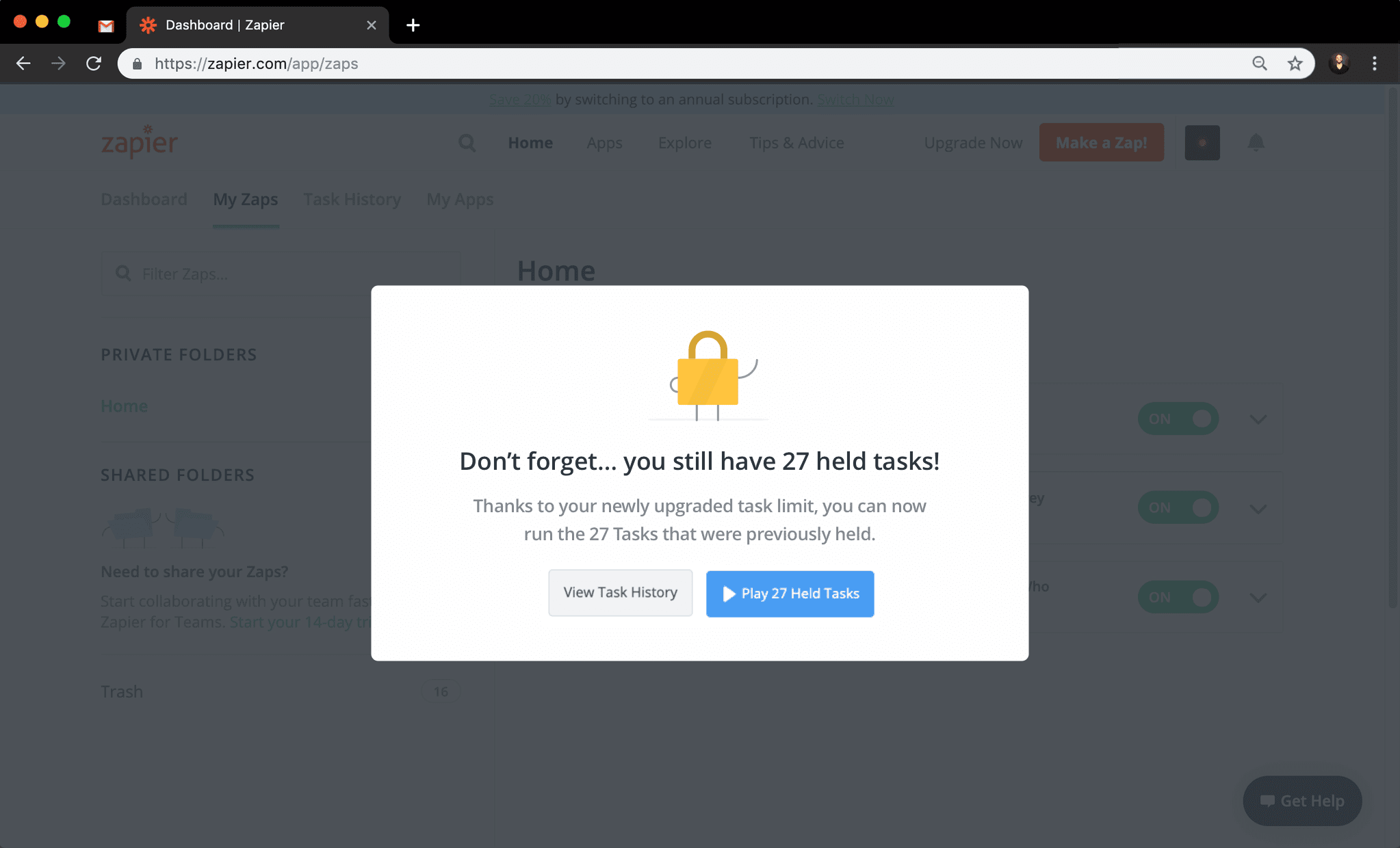
Feedback Loop
Your users typically upgrade to the premium version of your product for very specific reasons.
Have the end of your checkout experience reassure them with a clear feedback loop to minimize frustrations.
Oh, and one last thing for you… →
Psych Level
Checkout
Experience
Score:
C
Customer Journey
So far, here are the key moments in Zapier's upsell experience...
But the lack of coherence between the email's call-to-actions & the overly exhaustive landing page confused me.
(we still love Zapier though! ♥ )
A catchy subject line and the importance of Zapier for our business psyched me up right from the start.
The payment page was pretty straightforward despite the 15 navigation links.
The animation of confettis was a nice celebration, but…
…it wasn't clear if the held tasks were executed after the upgrade. I ended up having to contact their support. (Thanks Melanie Ryan from Zapier for your reply!)
Your retweets are always appreciated!
Just click here to do so:

🎉 Congrats! You found the secret slides!
Congrats!
You completed Growth.Design's Case Study:
"Zapier's Upsell"
