

Use your keyboard arrows
to view the story!
Tesla's Supercharging UX:
A Case Study On
Word-Of-Mouth

Story Duration: 5 min

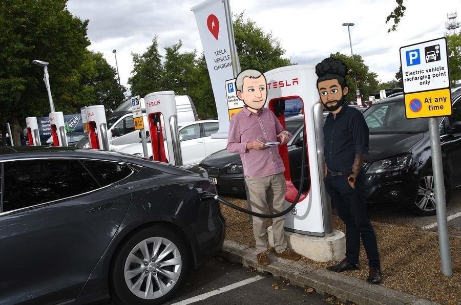
So I recently stopped at a Tesla Supercharger and…

…as I plugged the car, I realized that I had 15 min to spare so…

The first two steps were easy:
1. ✅ Park
2. ✅ Plug
…now, if you hop in the car—
I decided to analyze Tesla's charging experience!
(You'll soon see why this could be crucial for their word-of-mouth!)

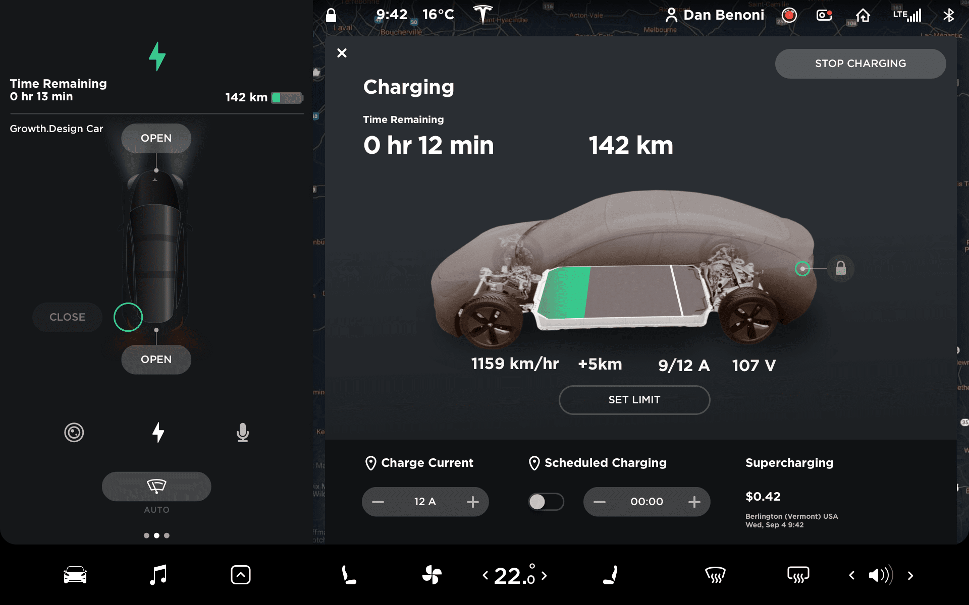
Skeuomorphism
Skeuomorphism is where a digital object mimics its real world counterpart1 to facilitate transition to new technology.
Charging a car is still a new concept for most of the population. Displaying a 3D car & a battery widget similar to those in smartphones makes this technology more approachable (familiarity bias).
1Skeuomorphism, Interaction-Design.org
That gave me an idea…
I interviewed some Tesla drivers and redesigned that screen based on their feedback…
—three things stand out on this dashboard.
I'll zoom in so you can see them better…
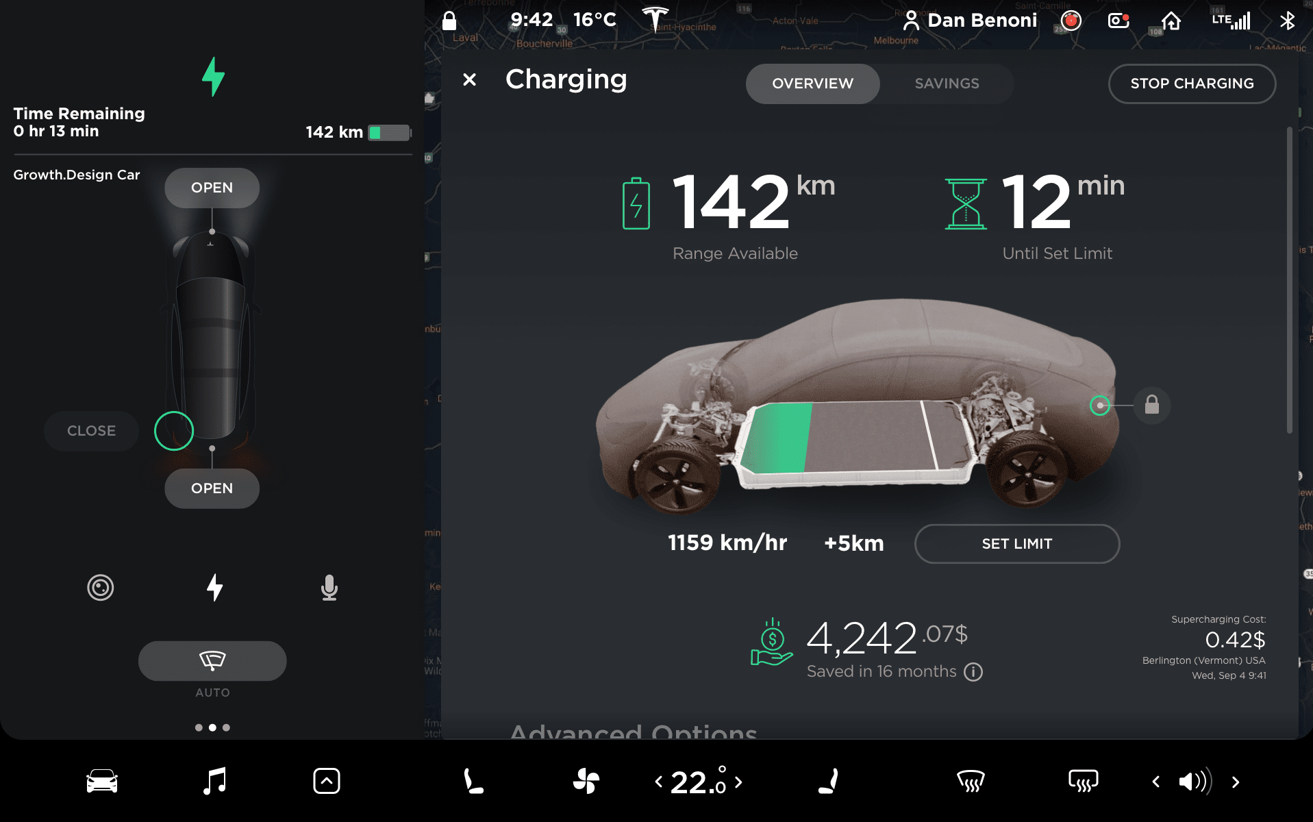
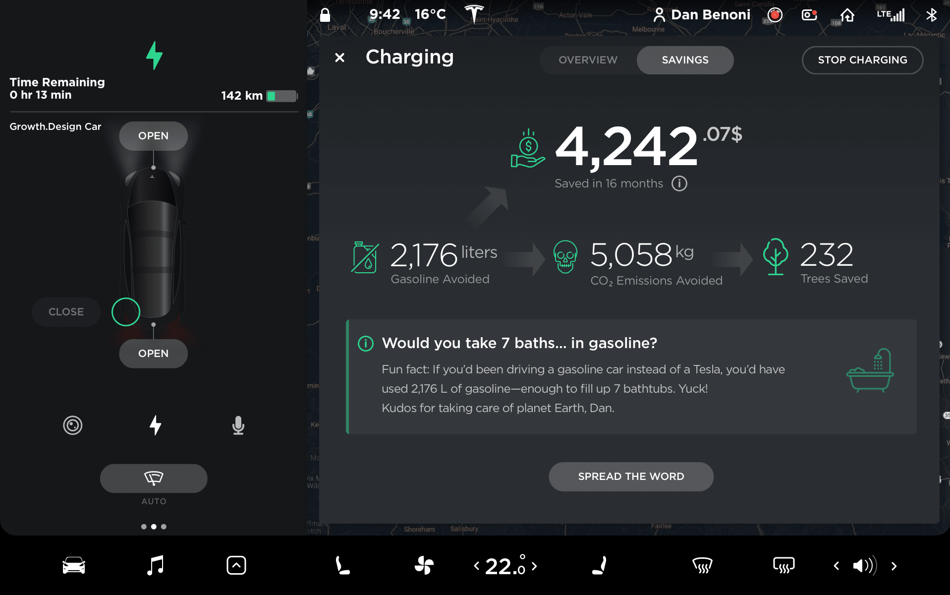
Emphasize Value Over Cost
Instead of focusing on what your customers are spending, show them what the value they are earning.1
In the current context, bringing more focus to the benefits (gasoline savings, environmental advantages) would help people associate charging with an even more positive experience.
This "savings" marketing strategy is ubiquitous on Tesla's website2, hence why not seeing it here is surprising.
1The Psychology of Pricing, Quicksprout (2019)2Tesla.com, Checkout Process (2019)

First, the 3D render makes it very clear that the car is charging.
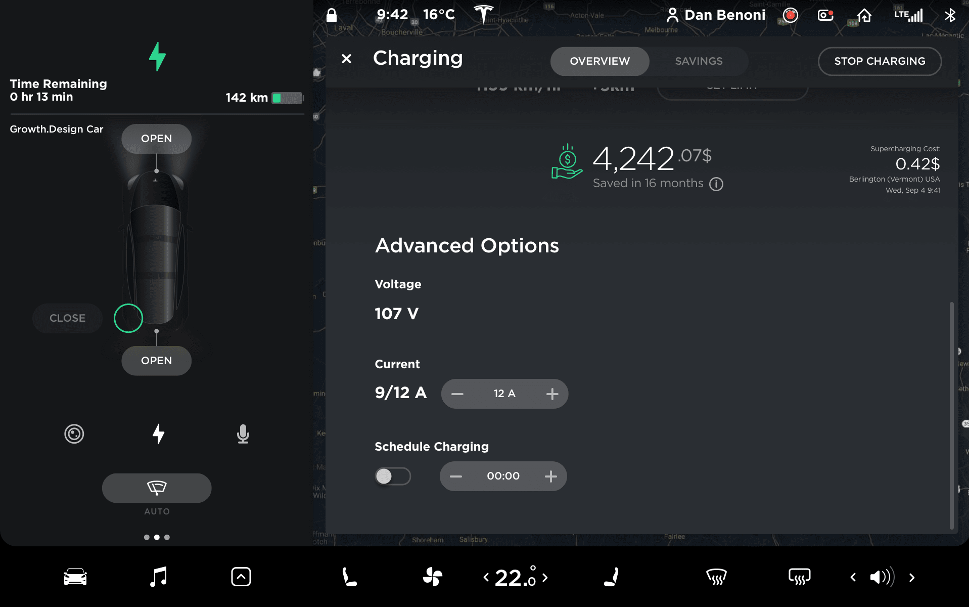
But unless you're an electrical engineer, those advanced options will likely confuse you.
Also—
—this interface mentions the costs, but not the benefits of being electric.


—what does "12 min"
really mean? Is it…
a) …to reach my "Set Limit"?
b) …to reach 100%?
c) the optimal time to continue my trip based on my final destination?
And finally—
Experimental Redesign
powered by Growth.Design
So… can you spot the 4 main differences in my redesign?
(Press ◀ to compare if you want)
⓵ I first adjusted the visual hierarchy and added descriptive labels.
⓶ I then moved all the confusing advanced options below, so that— {scrolling down}
—they don't clutter the interface of the top view.
Experimental Redesign
powered by Growth.Design
⓷ Also, notice this new savings widget.
This live counter reminds you of your real-time gasoline savings every time you charge your car.
…which leads us to this new "Savings" tab that also reveals… {tap}
Crossing The Chasm (Pricing)
Tesla's Model 3 outsold BMW, Lexus & Audi1. As Tesla is crossing the chasm2…
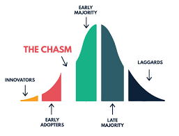
…the pricing & savings of the Model 3 are becoming increasingly important for the "Early Majority"—much more than for the wealthy initial "Innovators" (who bought the Roadster, Model S, Model X).
1Cleantechnica (2019)2Crossing The Chasm, Summary
Experimental Redesign
powered by Growth.Design
⓸ …the environmental benefits of choosing an electric car.
The problem is, vague statistics are hard for people to understand.
Tesla could hence use analogies like these to help support their mission.

The Power of Storytelling
Sharing a story, a vision and a mission is one of the most powerful ways to turn your customers into ambassadors.1
This interface could also be used to remind customers of Tesla's mission2:
"Accelerate the world’s transition to sustainable energy."
This brand message is very present on Tesla's Real-Time Carbon Impact Map3.
2Tesla.com, About (2019) 3Tesla.com, Carbon Impact (2019)
At that moment, someone in the parking lot waved at me so—

Word-of-Mouth Starts With
A Great Product
Elon Musk confirmed that word-of-mouth is Tesla's #1 source of growth1, and that it's mainly because of the quality of their products.2
Tesla is famous for its Net Promoter Score (NPS) of 963. In comparison, BMW's NPS is "good", but barely hits 40.
With 650,000+ Teslas on the road, making it easier for fans to spread the word can massively improve Tesla's referral rates and sales.
1Elon Musk's Twitter, (2018)2Youtube, Elon Musk Interview at 2m53s (2018)
3Consumer Reports, Car Brands Satisfaction (2019)
…open Tesla's phone app.
I briefly answered Nikola's questions, but really—I wanted to show him.
And not everyone's comfortable bringing a stranger in their car. So the easiest alternative is to…
—I got out of the car and greeted the stranger…
(Let's call him Nikola.)
Nikola told me he loved the design of the car, but…
…he was curious to hear more about the safety, performance, costs and environmental benefits…

…and that's the problem.
There really isn't much I could show to Nikola here.
Sidenote: It's also strange that even while charging, the app shows you more nearby Superchargers?
That gave me another idea of what Tesla could do to transform their app into a powerful tool for word-of-mouth…

Tadaaa!
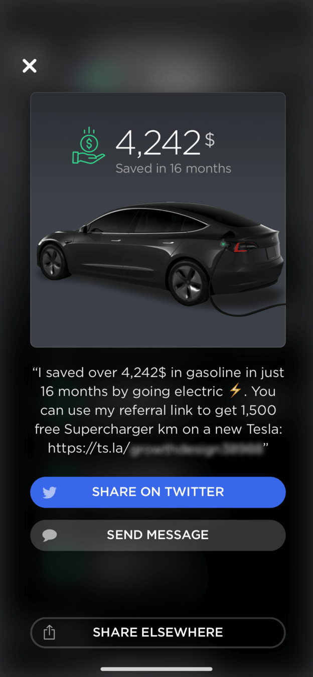
This live charging widget has two benefits:
⓵ It gives you something tangible to show when people ask you questions.
⓶ It reminds you of your impact & savings.
Experimental Redesign
powered by Growth.Design
Opportunity Signals
A simple Google search for
tesla savings spreadsheet
…returns 350,000 results1.
This is a strong signal that this experiment would address users' needs while improving their overall experience.
1Google, Search Results for "tesla savings calculator"Plus, people often check their app to see the progress of their charge.
That's when this button serves as— {tap}
Experimental Redesign
powered by Growth.Design
—a perfect trigger to either:
a) Build awareness on social media, or…
b) Share your referral code directly with people like Nikola.
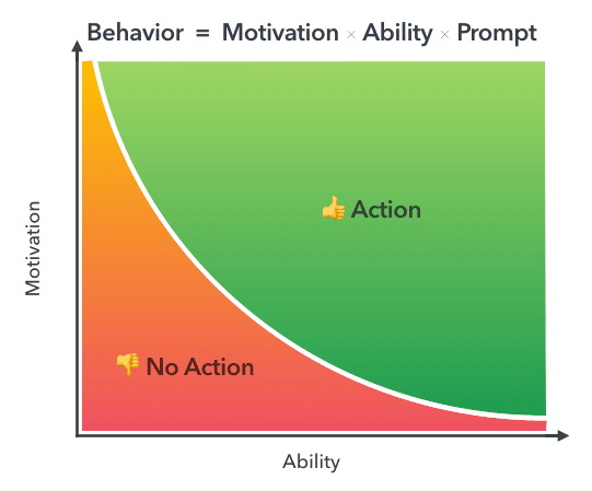
Prompts & Triggers
Small nudges placed on our regular paths remind us to take action.
According to the Fogg Behavioral Model (B=MAP)1, someone might be extremely motivated to talk about your brand (e.g. a Tesla fan), but without a prompt, few will take action.1
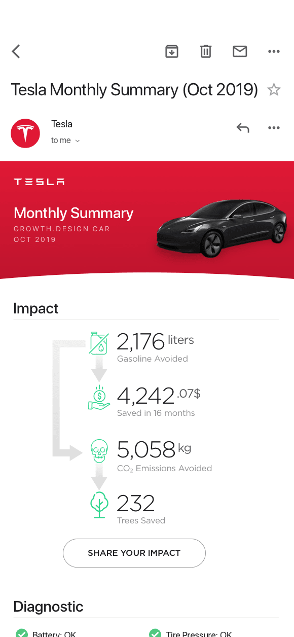
—use a "Tesla Monthly Summary" email to introduce those concepts instead.
—a fair argument against this approach would be that it might bring too much "marketing" during the charging experience.
A simple way to mitigate that risk would be to—
But back to the story…
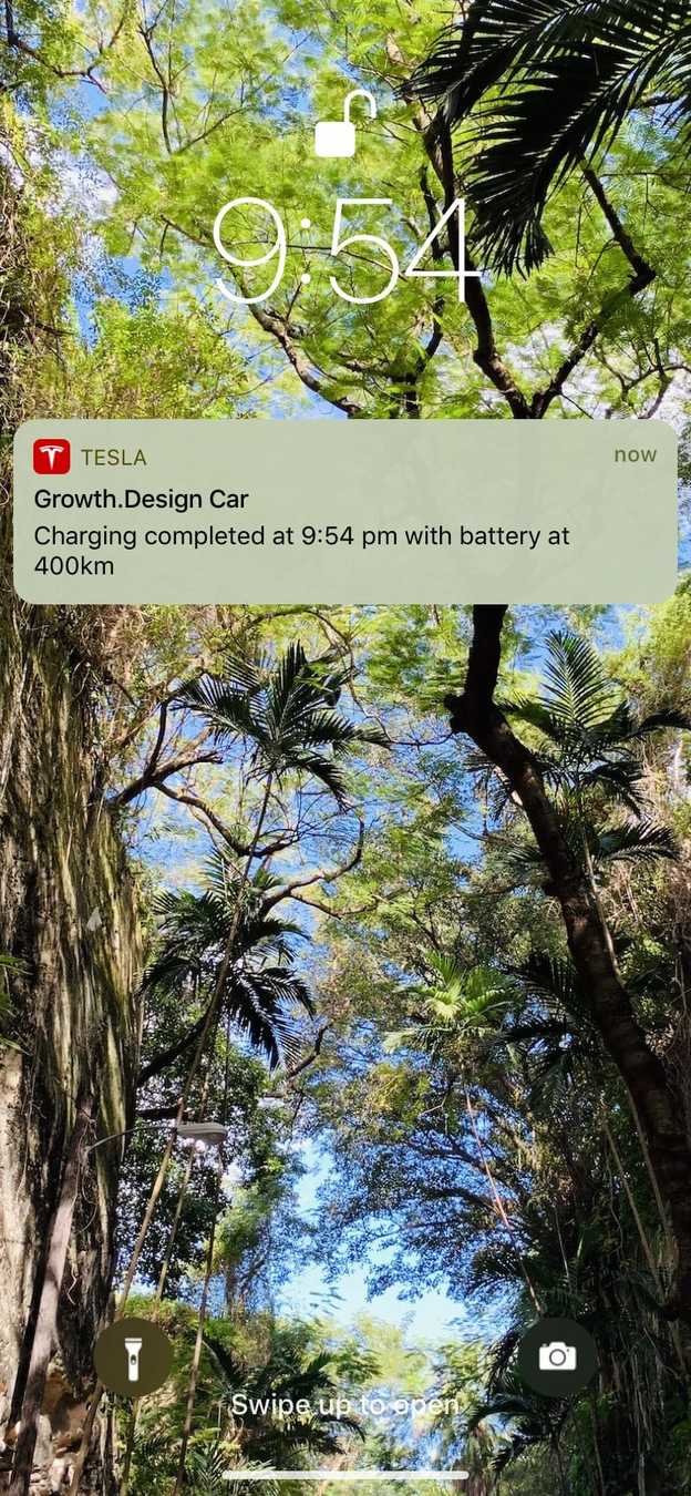
Shortly after the Nikola left, I received this notification…
So naturally you unplug the car & sit down in the driver seat…
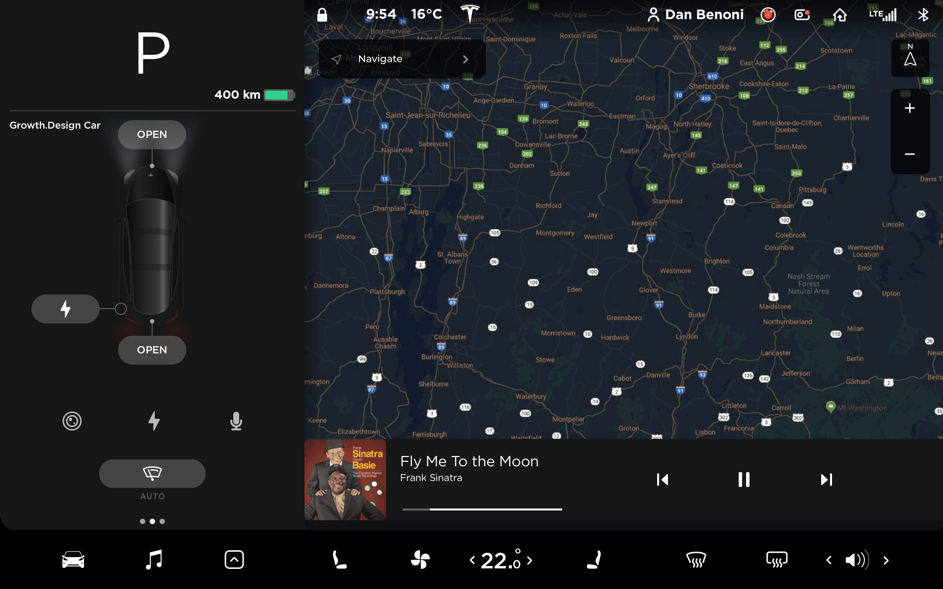
To be fair, "navigating" is a logical subsequent action, but Tesla is missing an opportunity here…
Why not reward this user journey with…
…and as a way of ending this premium Supercharger experience…
…your Tesla dashboard
shows you a beautiful—
—empty map…!?

Experimental Redesign
powered by Growth.Design
Peak-End Rule
We judge our experiences almost entirely by their peaks (pleasant and unpleasant) and how they ended.1
By highlighting the range gains & gasoline savings, Tesla could associate a positive emotion to the end of the charging experience.
This would help the "Cue → Routine → Reward" loop2, making the charging habit more rewarding and more likely to be talked about.
1Wikipedia, Peak-End Rule (2019)2The Power of Habits, Charles Duhigg (2014)
…one last reminder of what the user just accomplished!
Oh, and one last thing for you… →
Psych Level
Charging
Experience
Score:
B-
Customer Journey
So far, here are the key moments in Tesla's charging experience...
But the charging dashboard felt more like an electrical engineering class and didn't focus enough on the gasoline savings…
Parking the Tesla and plugging the Supercharger was a breeze.
I was happy to spread the word about Tesla to my new friend Nikola, but couldn't really show him the dashboard so…
I showed Nikola the phone app. Unfortunately, there wasn't much to show there.
…finally, a nice notification told me the charging was completed.
But as I sat down, the lack of final reward made the dashboard experience a bit anti-climatic.
Your retweets are always appreciated!

🎉 Congrats! You found the secret slides!
Congrats!
You completed Growth.Design's Case Study:
"Tesla's Word-Of-Mouth"
